
Xbox ONE
Brand and packaging design for Microsoft.
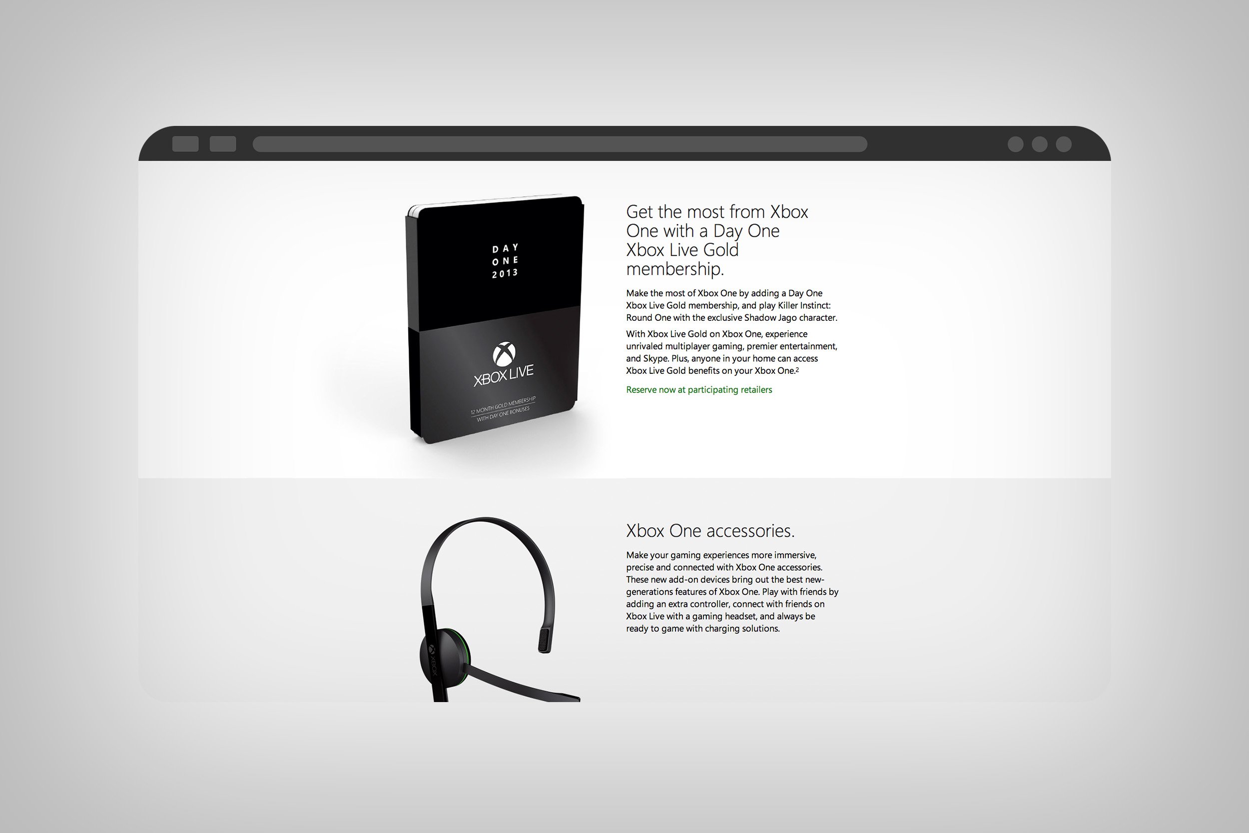
The launch of the Xbox One represented a significant strategic shift for the brand, as they aimed to position the console as an all-encompassing entertainment system for a broader and family-friendly audience. Not to be forgotten, the Xbox 360, which was primarily known as a system for core gamers and needed to come along on this journey. And needed an updated look and feel as well to align with the new brand positioning.
Created while at JDK Design
Creative Direction: Michael Jager, Jessica Vollendorf, Louis Carlton, Ben Hermel, John Siddle
Core Design Team: Justin Lucero (that’s me), Trent Mitchell, Jeremy Harrington, Sarah Williams, Jen Cogliantry, Vicki Julius

As a designer on the team, my role was to help develop a visual identity that reflected the Xbox One's expanded capabilities and appealed to a wide audience. I was part of a diverse team responsible for creating branding elements, visual identity, packaging designs, and establishing a cohesive visual language. We collaborated closely with internal teams to ensure creative alignment and move quickly as things shifted and maintained a fluid workflow.
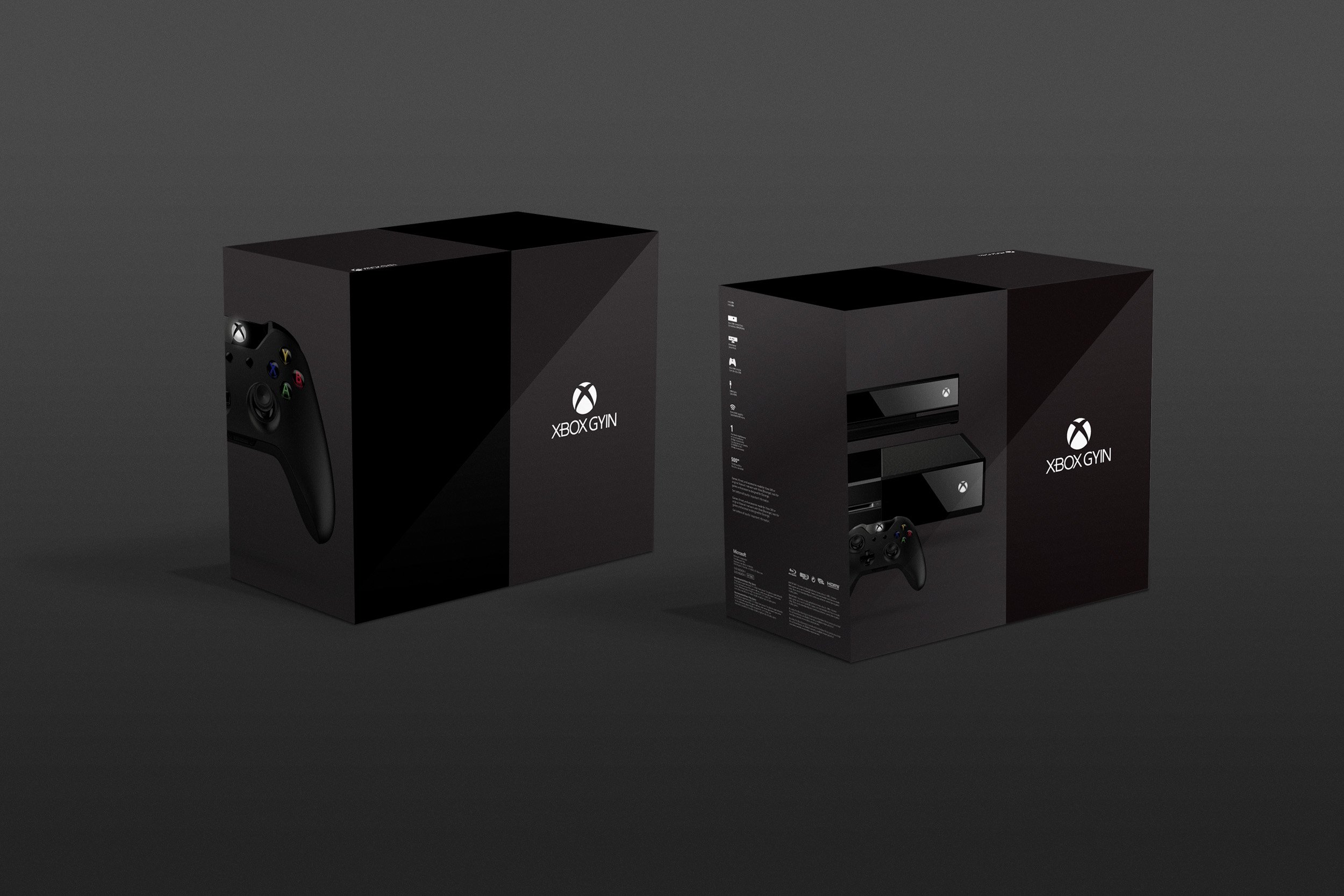
To achieve our objectives, we embarked on a comprehensive design process. We began by exploring various design expressions and evaluating their compatibility with the console and accessory packaging, retail executions, and brand posters. One key aspect of our work involved updating the logo. We transitioned from the previous dimensional sphere with aggressive cuts to a more rounded shape, which we affectionately referred to as "removing the crust." This evolution in logo design conveyed a more modern and approachable image, better suited to the Xbox One's new positioning.


One of the major challenges we encountered during this project was the high level of secrecy surrounding the launch of the Xbox One. The entire project was shrouded in secrecy, with strict confidentiality measures in place. We operated under code names and were not privy to the actual product name until very late in the game.
This level of secrecy posed unique challenges for our team. It required us to exercise extreme caution when discussing the project, both within the team and with external stakeholders. We had to be mindful of our communications and ensure that no sensitive information was inadvertently leaked. This added an extra layer of complexity to the project, as we had to work within these constraints while still delivering exceptional design solutions.


Despite the challenges, our team embraced the secrecy and saw it as an opportunity to fully immerse ourselves in the project. We remained focused and dedicated to delivering outstanding results, even without full knowledge of the final product name.
Overall, the secrecy surrounding the Xbox One launch presented a challenging yet exciting environment for our team. It demanded a heightened level of discretion and professionalism throughout the project, adding an element of intrigue and anticipation to our work.

The collaborative efforts of our team culminated in a compelling visual identity for the Xbox One brand. The updated logo and overall visual language successfully conveyed the console's enhanced capabilities, while maintaining a broad appeal to both core gamers and new audiences. The packaging designs and retail executions aligned seamlessly with the new brand positioning, creating a cohesive and impactful presence in the market.
In summary, my contribution as a graphic designer for the Xbox One launch involved developing a visual identity that effectively communicated the console's expanded features and appealed to a broader demographic. Through extensive design exploration, we refreshed the logo and established a cohesive visual language that aligned with the brand's new positioning. The result was a successful launch that positioned the Xbox One as an all-encompassing entertainment system for the living room, catering to a diverse audience.